0

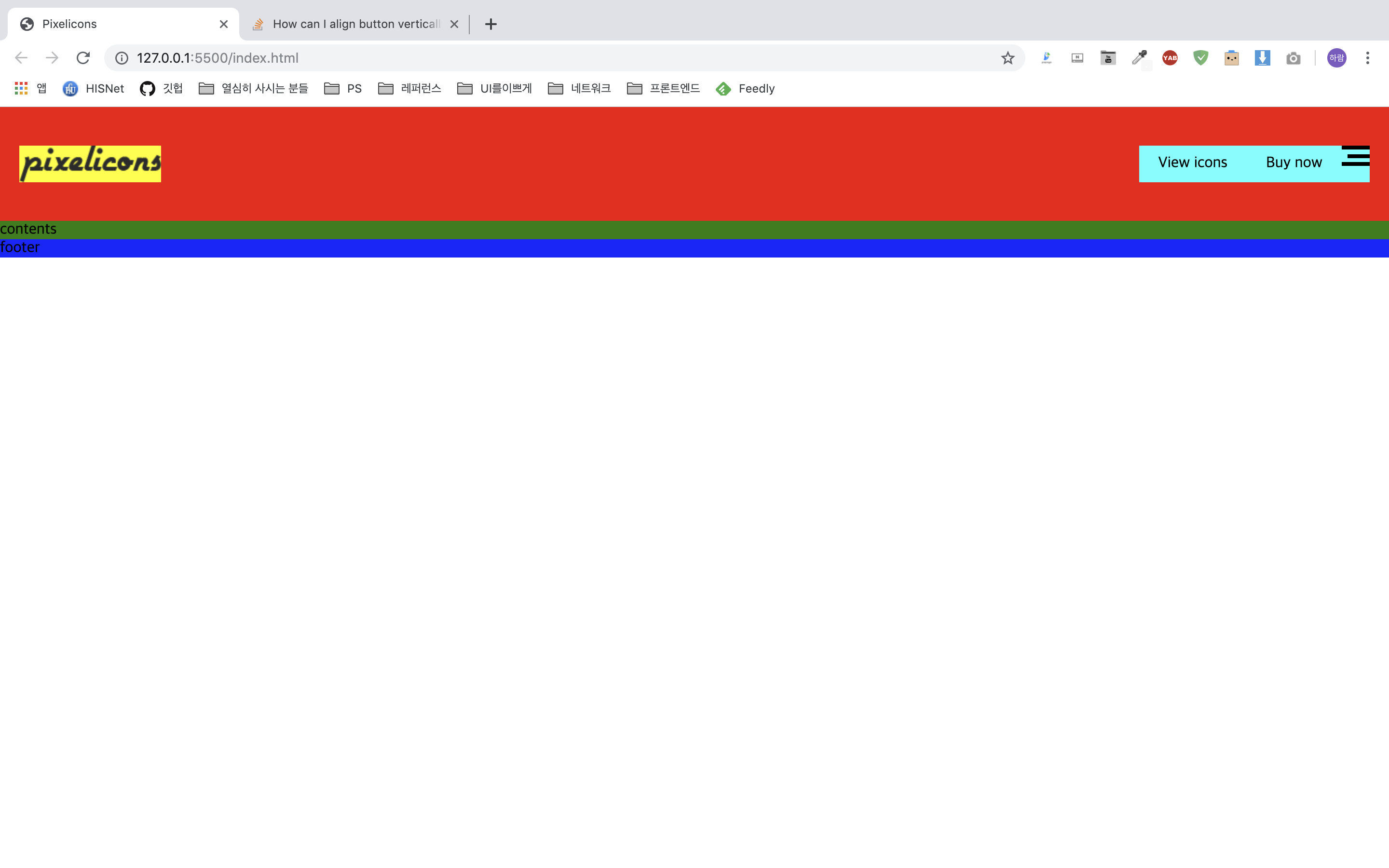
I'm practicing creating a website, and am currently trying to replicate this site. At the moment I am working on the navigation bar, but I am unable to vertically align the button vertically in the nav.

.header {
  background-color: red;
  padding: 40px 20px;
}

.header h1 {
  background-color: yellow;
  float: left;
}

.header h1 img {
  display: block;
}

.header__nav {
  background-color: aqua;
  float: right;
}

.header__nav li {
  float: left;
  height: 38px;
}

.header__nav li a {
  padding: 0 20px;
  display: inline-block;
  line-height: 38px;
}

.contents {
  background-color: green;
}

.footer {
  background-color: blue;
}
<header class="header clearfix">
  <h1>
    <a href="#"><img src="https://pixelicons.com/wp-content/themes/pexelicons/assets/pic/site-logo/logo.png" alt="Logo"></a>
  </h1>
  <nav class="header__nav">
    <ul class="clearfix">
      <li><a href="#">View icons</a></li>
      <li><a href="#">Buy now</a></li>
      <li><button class="menu">menu</button></li>
    </ul>
  </nav>
</header>
<section class="contents">
  contents
</section>
<footer class="footer">
  footer
</footer>

My working image

I wanna align the top-right button of the nav bar vertically. I know this can be solved using display: flex;, but I wanna solve it another way. Is there a proper way to solve this issue?

mullac
  • 643
  • 6
  • 15
webmaker
  • 498
  • 1
  • 3
  • 16

2 Answers2

2

Even though your solution using display: flexseems perfectly fine to me, you could fix it using vertical-align: middle; and display: inline-block on all of the items (the two links and the button)

Janis Jansen
  • 795
  • 1
  • 12
  • 29
  • Can you explain why your solution works? – webmaker Jul 17 '19 at 06:27
  • @HaramBae yes: display: inline-block is used to position all elements in a horizontal line to each other while keeping a block-like behavour (setting width/height, margins etc.) and "vertical-align" is for positioning elements in certain ways vertically. If this works for you let others know by marking the answer as correct please. – Janis Jansen Jul 17 '19 at 06:30
  • your use display:flex and text-align:center – Arpit Jain Jul 17 '19 at 06:37
0

.header {
  background-color: red;
  padding: 40px 20px;
}

.header h1 {
  background-color: yellow;
  float: left;
}

.header h1 img {
  display: block;
}

.header__nav {
  background-color: aqua;
  float: right;
}

.header__nav li {
  float: left;
  height: 38px;
}

.header__nav li a {
  padding: 0 20px;
  display: inline-block;
  <!-- Remove - line-height: 38px; -->
}

.contents {
  background-color: green;
}

.footer {
  background-color: blue;
}
<!-- new added class -->
.clearfix{
  display: flex;
  align-items: center;
}
<header class="header clearfix">
  <h1>
    <a href="#"><img src="https://pixelicons.com/wp-content/themes/pexelicons/assets/pic/site-logo/logo.png" alt="Logo"></a>
  </h1>
  <nav class="header__nav">
    <ul class="clearfix">
      <li><a href="#">View icons</a></li>
      <li><a href="#">Buy now</a></li>
      <li><button class="menu">menu</button></li>
    </ul>
  </nav>
</header>
<section class="contents">
  contents
</section>
<footer class="footer">
  footer
</footer>