For some reason Chrome shows this span unusually higher than FireFox.
As a result, I wrote the following CSS:
@media screen and (-webkit-min-device-pixel-ratio: 0) {
  .selector:not(*:root),
  span.justForChrome {
    display: block;
    margin-top: 23%;
    text-align: right;
  }
}
The following is the HTML:
  <li class="nav-item">
    <a
      class="nav-link"
      data-toggle="tooltip"
      title="Shopping cart"
      id="{{ shoppingCart }}"
      routerLink="/shopping-cart"
      ><span class="justForChrome"
        >Shopping Cart<span id="counter">{{ counter }}</span></span
      ></a
    >
  </li>
While this is working in Chrome, now FireFox is showing the span to high. If I set the margin-top to 100% in FireFox developer tools, then it is perfect, but margin-top at 100% on Chrome sends the span upwards.
What can I do? I swear this was working a few weeks ago. I would expect that firefox would not even find the span.justForChrome selector rule in the CSS
Thanks in advance
UPDATE
In case anyone else is going through this, I thought I would show what finally worked. Whether it is the fact that I have to compile the Angular app, which creates a new "bundled" stylesheet or if it is because I placed the media queries at the end of the scss file, I do not know, but here are the media queries that I used at the end of the scss file, which worked:
@media all and (-webkit-min-device-pixel-ratio: 0) and (min-resolution: 0.001dpcm) {
  .selector:not(*:root),
  span.justForChrome {
    display: block;
    margin-top: 23%;
    text-align: right;
  }
}
@-moz-document url-prefix() {
  span.justForChrome {
    display: block;
    margin-top: 94px !important;
    text-align: right;
  }
}
Currently the site is still in beta, but here is a :
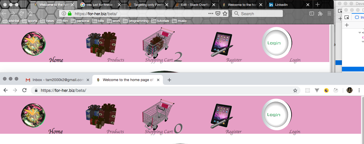
Both the words "Shopping Cart" and the number are on the "baseline" of the navbar.
As usual, thanks for all the help.