9

I have a hybrid HTML5 app created using the Trigger.io framework.

The app contains a fixed footer and a scrolling content area. The app works fine on all devices except the iPhone X. On the iPhone X when I scroll the content area, the footer actually scrolls out of view a little.

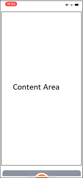
This is how the app looks when the footer is in view

Normal app view

But once I scroll down, the footer hides and only shows when I scroll up again.

Scrolled app view

I've applied the iPhone X optimizations for the notch and that works fine in the design. The only issue that remains is the scrolling problem.

Since I'm using a hybrid framework, the view is constructed with HTML + CSS and not native UI components.

Any thoughts on why the footer might be scrolling down on iPhone X?

JohnP
  • 47,501
  • 10
  • 101
  • 134
  • 1
    I had the same with fixed headers on iPhone SE in the past. They would only stay fixed the first half of the page. How did you fix the footer in CSS? Can you share the code? – Brainfeeder May 11 '18 at 11:40
  • 2
    Can you provide your code so we can try to work it out? – MarioE May 11 '18 at 21:49
  • can you switch from `UIWebView` to `WKWebView`? – Manuel Otto May 12 '18 at 07:17
  • @ManuelOtto Yup, I tried switching to WKWebView but the problem still persisted – JohnP May 13 '18 at 08:40
  • @MarioE sorry, there isn't any actual code I can actually give out. I'm using bootstrap 3 as the core CSS with a modified fixed header/footer style. – JohnP May 13 '18 at 08:41
  • @Brainfeeder I'm using a regular `position:fixed` style layout to have it fixed. iPhones did have some problems with fixed elements but they are mostly gone now. Make sure you're not using fixed position within a transformed element (like translate3d) – JohnP May 13 '18 at 08:42
  • Have you tried: `position: device-fixed;`? – web-stars May 15 '18 at 06:19

5 Answers5

8

You could try placing the div outside of the scrollable part, and have the position fixed. So if you have a code where it scrolls,

<div id="scroll-container">
  <div id="scrollable">
  </div>
<div>

Such where any element in the div scroll-container, it will scroll.

If you place it outside of the scrollable part,

<div id="scroll-container">
<div>
<div id="not-scrollable">
</div>

and put position:fixed; or position:absolute; or position: sticky;(Brainfeeder)(I haven't tried it yet though) or device-fixed;(web-stars)(Haven't tried it either) in the css for #not-scrollable, It shouldn't scroll. Try it out.

Of course, this won't make it relative to the scrolling container, it will make it relative to whatever container it is in, and in this case, it is the body tag.

Note: I am just using a div as an example. You may use this any way you want

New: In the case that the body is your scroll, add a div inside the body tag but right after you declare the body tag so that the scroll is the div.

There are a bunch of sites that show you how to adopt a web page to iPhone X. Here's one of them.

Random Channel
  • 1,134
  • 9
  • 22
  • Breaking up and redoing the layout is what I have planned as the last resort, will let you know how this goes. Will let you know how this goes. – JohnP May 14 '18 at 03:54
  • Not yet. And I think my image caused a little confusion here. The content area that scrolls is actually the `body` tag. I don't actually have a fixed height content area. So the nav can't actually be moved out of it. But I will try moving the nav out of its current parent to see if that might work. – JohnP May 16 '18 at 04:27
  • Thanks man, but this approach doesn't work either. It appears that the body height appears to be larger than the viewport height. Trying a couple of other variations on this. – JohnP May 16 '18 at 19:51
3

I used position:sticky; in previous web projects. Turns out it works in most cases. Can you use position sticky?

Another thing to try (I had to do this for FireFox and iOS Safari to fix some bugs) is to wrap the entire content in a <div>, including the fixed elements (header / footer, ...) Turned out they were fixed / sticky relative to their parent, once the parent ended, fixed and/or sticky broke resulting in various bugs.

If this simple fix does not work, I would go for the answer from @RandomChannel.

Brainfeeder
  • 2,477
  • 2
  • 16
  • 35
  • I have the content wrapped in a div, but that didn't seem to work. I'm trying a few other variations of this now. – JohnP May 16 '18 at 19:53
3
 <div class="main_div">
    <div class="scrollble">
    // scrollable content
    some text goes heresome text goes here
    some text goes heresome text goes here
    some text goes heresome text goes here
    some text goes heresome text goes here
    some text goes heresome text goes here
    some text goes heresome text goes here
    some text goes heresome text goes here
    some text goes heresome text goes here
    </div>
    <div class="footer">
    // fixed footer
    </div>
</div>

// CSS

.main_div {
 height: 100vh;
 position: fixed;
 }
.scrollble {
 height: 95vh;
 overflow-y:auto; 
 border: 1px solid #000;
}
.footer {
 height: 5vh; 
position: fixed; 
width: 100%; 
}
vinaykumar0459
  • 461
  • 5
  • 15
2

Proposing an idea to fix it with JQuery

CSS

body
  margin: 0

#WhatEverClassOrIdYouGaveIt
  height: 10em // or whatever size u want
  width: 100%
  //background-color: red
  position: absolute // or fixed

JQuery

resize = () => {
  var o = $(document)
  dW = o.width() //Not needed
  dH = o.height()
  $("#WhatEverClassOrIdYouGaveIt").css({
    top: dH - $("#WhatEverClassOrIdYouGaveIt").height()
  })
}

$(window).resize(() => {
  resize()
})

resize()
SithLee
  • 56
  • 4
  • Sorry, I tried this out and this didn't work. This approach is equivalent to setting the value using CSS as `dH - elem.height()` would only need to be calculated once – JohnP May 14 '18 at 03:53
0

Do not use fixed position in CSS. Try the translateZ() CSS function that repositions an element along the z-axis in 3D space, i.e. closer to or farther away from the viewer. Its result is a <transform-function> data type.

Here's an HTML code:

<div>Static</div>
<div class="moved">Moved</div>

Here's an CSS code:

div {
  position: relative;
  width: 100px;
  height: 1000px;
  left: 200px;
  background-color: black;
}
.moved {
  transform: perspective(400px) translateZ(180px);
  background-color: red;
}
Andy Fedoroff
  • 26,838
  • 8
  • 85
  • 144