Hello I am trying to create this in HTML + CSS.
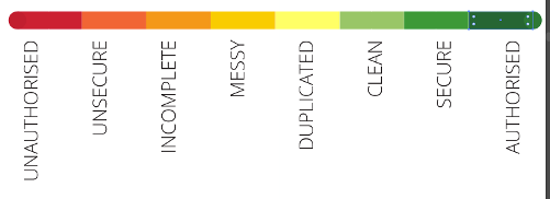
I have everything working, except the horizontal alignement of the legend is wrong, and the whole legend is offset.
.barometer-body>div {
  float: left;
  width: 12.5%;
  height: 1.3em;
  display: inline-block;
}

.barometer-body>div:nth-child(1) {
  background-color: #CC0033;
}

.barometer-body>div:nth-child(2) {
  background-color: #FF6633;
}

.barometer-body>div:nth-child(3) {
  background-color: #F49819;
}

.barometer-body>div:nth-child(4) {
  background-color: #FFCC00;
}

.barometer-body>div:nth-child(5) {
  background-color: #FFFF66;
}

.barometer-body>div:nth-child(6) {
  background-color: #99C667;
}

.barometer-body>div:nth-child(7) {
  background-color: #349937;
}

.barometer-body>div:nth-child(8) {
  background-color: #006633;
}

.barometer-legend>div {
  width: 12.5%;
  float: left;
  font-size: 2em;
  line-height: 12.5%;
  display: inline-block;
  transform: rotate(90deg);
  transform-origin: left top 0;
}
<div class="barometer-body">
<div></div>
<div></div>
<div></div>
<div></div>
<div></div>
<div></div>
<div></div>
<div></div>
</div>
<div class="barometer-legend">
<div>One</div>
<div>Two</div>
<div>Three</div>
<div>Four</div>
<div>Five</div>
<div>Six</div>
<div>Seven</div>
<div>Eight</div>
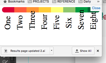
</div>What CSS method should I use for aligning the rotated text to the center position of it's associated segment?
EDIT: thanks to @ovokuro I have an almost perfect solution. I'm happy to use flexbox for this. However when I reduce the viewport, the alignment seems to switch to left rather than right which causes the text to look messy. How would I fix this?