2

Our site needs some color swatches for our products and the boss wants them to look exactly as they do in the print catalog. This means a horizontal row of squares, each a different color, and with the name of that color overlaid in its absolute center. Like so:

Catalog's row of swatches

I've tried two different methods for making the swatches on our web site follow this established convention, but it's just not happening for some reason. And, yes, I am still a bit of a newbie, it would seem.

Here's my first attempt, using a display:table/display:table-cell method:

JSFiddle

<p>Standard Ink Colors</p>
<ul class="color-list">
  <li id="thumb-red">
    <p>Red</p>
  </li>
  <li id="thumb-orange">
    <p>Orange</p>
  </li>
  <li id="thumb-athleticgold">
    <p>Athletic Gold</p>
  </li>
</ul>
<p>Be sure to specify Standard ink color above or provide us with your PMS ink number. </p>

enter image description here

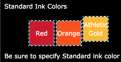
Everything lines up along the last baseline of text.

So I tried using Flexbox:

JSFiddle

<p>Standard Ink Colors</p>
<ul class="color-list">
  <li id="thumb-red">Red</li>
  <li id="thumb-orange">Orange</li>
  <li id="thumb-athleticgold">Athletic Gold</li>
</ul>
<p>Be sure to specify Standard ink color above or provide us with your PMS ink number. </p>

enter image description here

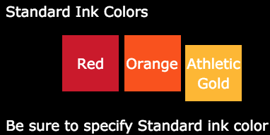
Similar problem, only now things line up on the first baseline.

Is there any fix for this?

Community
  • 1
  • 1
Sturm
  • 595
  • 1
  • 17
  • 48

3 Answers3

2

Make the parent of the individual items a flex container. This will activate several default settings:

  • flex-direction: row - each child element ("flex item") is forced into a single row
  • flex-wrap: nowrap - items will not be able to wrap

Then make each flex item of the main container double as a (nested) flex container. This will allow you to control the alignment of the child elements (text, in this case).

With justify-content, align-items and text-align all set to center, the text will always be vertically and horizontally centered.

.color-list {
   display: flex;
   justify-content: center;
   padding: 0;
}
.color-list li {
   display: flex;
   justify-content: center;
   align-items: center;     
   text-align: center;
   width: 4em;
   height: 4em;
}
#thumb-red          { background-color: #CE1126; }
#thumb-orange       { background-color: #FE5000; }
#thumb-athleticgold { background-color: #FFB81C; }
<ul class="color-list">
  <li id="thumb-red">Red</li>
  <li id="thumb-orange">Orange</li>
  <li id="thumb-athleticgold">Athletic Gold</li>
</ul>

Regarding the misalignment in your original code...

In a general sense, there's no reason to use display: inline-flex on each item. If, however, this is a requirement you have, then simply add vertical-align: middle or top to each li. Here's the explanation: Why is there a vertical scroll bar if parent and child have the same height?

Browser support:

Flexbox is supported by all major browsers, except IE < 10. Some recent browser versions, such as Safari 8 and IE10, require vendor prefixes. For a quick way to add prefixes use Autoprefixer. More details in this answer.

Community
  • 1
  • 1
Michael Benjamin
  • 265,915
  • 79
  • 461
  • 583
  • 1
    I really like this answer, as it keeps all of the swatches the exact same width. It also allows for each of the `li` elements to wrap for responsive purposes once I turn on `flex-wrap: wrap`. I just also needed to remove the `justify-content: center` style from the `.color-list` selector, since I wanted them to wrap back to the left margin instead of the center. Awesome answer, @Michael_B, and thanks for being so thorough! – Sturm Oct 19 '16 at 14:17
1

You can use any approach. Just apply vertical-align: top; in .color-list li

aashi
  • 462
  • 3
  • 11
1

I made some changes in your css. Added display: table in your container and display: talbe-cell.

.color-list {
  display: table;
}
.color-list li {
  width: 4em;
  height: 4em;
  display: table-cell;
  vertical-align: middle;
  text-align: center;
}

.color-list li > p {
  text-align: center;
}

#thumb-red {
  background-color: #CE1126;
}

#thumb-orange {
  background-color: #FE5000;
}

#thumb-athleticgold {
  background-color: #FFB81C;
}
<p>Standard Ink Colors</p>
<ul class="color-list">
  <li id="thumb-red">
    <p>Red</p>
  </li>
  <li id="thumb-orange">
    <p>Orange</p>
  </li>
  <li id="thumb-athleticgold">
    <p>Athletic Gold</p>
  </li>
</ul>
<p>Be sure to specify Standard ink color above or provide us with your PMS ink number. </p>

I hope I was helpfull

Leonardo Costa
  • 442
  • 2
  • 12
  • This was very helpful, yes. The only problem with it is that the `p` tags need to be removed from the HTML. Once this is done, your suggest worked perfectly… well, almost. In fact, I almost went with this solution until I found its one problem: No wrapping. I assume that the `display: table` style is the reason for it. After adding about a dozen or so more `li` elements, the row of swatches became squashed and then bled to the right of the Bootstrap column it was inside. Thus, I've decided to go with the Flex answer, even though it isn't as widely-supported. Thanks for the awesome help! – Sturm Oct 19 '16 at 14:01
  • 1
    No problems, @Sturm! My intention was to help in some way. Really, I think the response that contains the flex-box is the best alternative. The most important is the exchange of knowledge. I thank you for your feedback. – Leonardo Costa Oct 19 '16 at 14:32