*{
box-sizing: border-box;
}
.results__item{
float: left;
width: calc(100%/3 - 40px/3)
}
.results__item:nth-child(3n-1){
margin-left: 20px;
margin-right: 20px;
}
.results__item__img-wrapper{
overflow: hidden;
}
.results__item__img-wrapper img{
width: 100%;
height: calc(100%/3 - 40px/3 + 90px)
}
.results__item__content{
word-wrap: break-word;
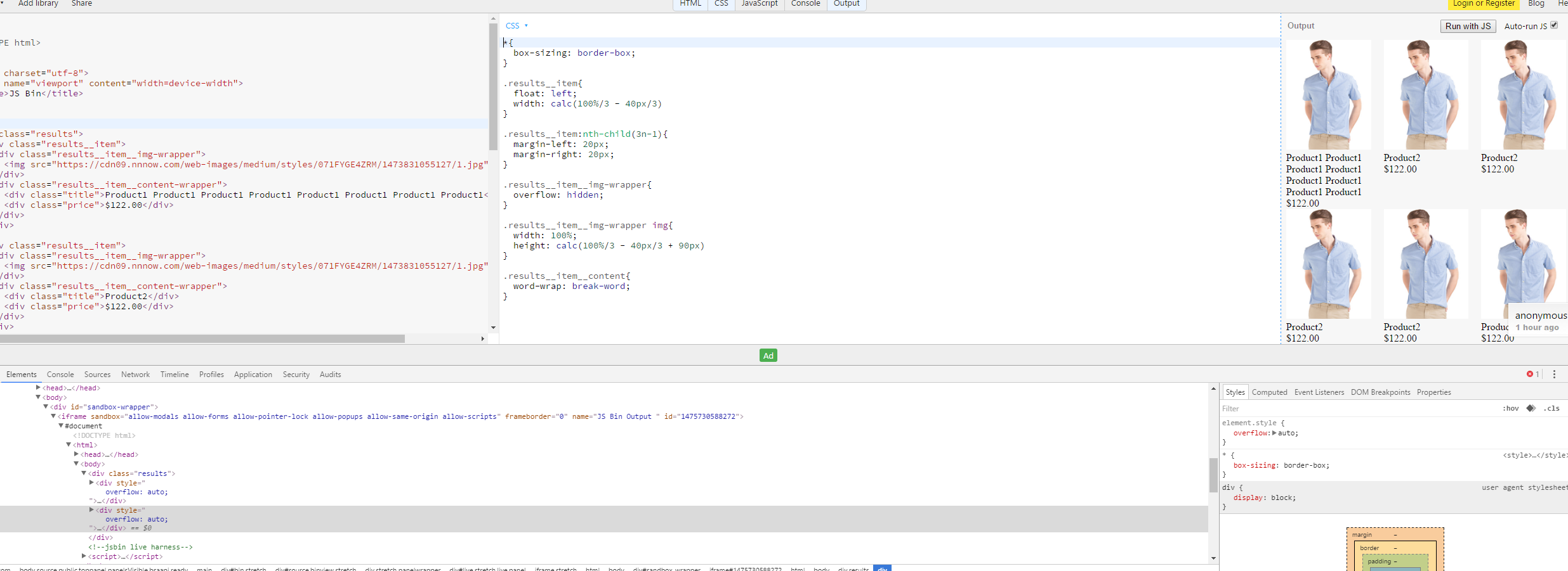
}<div class="results">
<div class="results__item">
<div class="results__item__img-wrapper">
<img src="https://cdn09.nnnow.com/web-images/medium/styles/071FYGE4ZRM/1473831055127/1.jpg" alt="">
</div>
<div class="results__item__content-wrapper">
<div class="title">Product1 Product1 Product1 Product1 Product1 Product1 Product1 Product1</div>
<div class="price">$122.00</div>
</div>
</div>
<div class="results__item">
<div class="results__item__img-wrapper">
<img src="https://cdn09.nnnow.com/web-images/medium/styles/071FYGE4ZRM/1473831055127/1.jpg" alt="">
</div>
<div class="results__item__content-wrapper">
<div class="title">Product2</div>
<div class="price">$122.00</div>
</div>
</div>
</div>I have created a grid layout. When the content of one item is more, the height of the row is not adjusting accordingly. How can I accomplish that?
Note: I dont want to use javascript for this. I am sure, this is possible with CSS