Hello everyone and I hope you're doing well. I am using Isotope and below you can see the JavaScript that I have written. I find it impossible to center li elements if they are the Isotope elements. To see what I mean by centering, please see the images below. I've managed to center the whole Isotope to the screen but I need the elements to be centered too and not just float to the left side.
Let's start with my script code:
<script>
 $(document).ready(function(e) {
    $(".ullist li").addClass('element-item');
});

</script>
<script>
$(document).ready(function(e) {
// external js: isotope.pkgd.js

// init Isotope
var $grid = $('.grid').isotope({
  itemSelector: '.element-item',
  //layoutMode: 'fitRows',
});
//$('.grid').isotope({ layoutMode : 'fitRows' });
// filter functions
var filterFns = {
  // show if number is greater than 50
  numberGreaterThan50: function() {
    var number = $(this).find('.number').text();
    return parseInt( number, 10 ) > 50;
  },
  // show if name ends with -ium
  ium: function() {
    var name = $(this).find('.name').text();
    return name.match( /ium$/ );
  }
};

// bind filter button click
$('#filters').on( 'click', 'a', function() {
  var filterValue = $( this ).attr('data-filter');
  // use filterFn if matches value
  filterValue = filterFns[ filterValue ] || filterValue;
  $grid.isotope({ filter: filterValue });
});

// change is-checked class on buttons
$('.secmenu ul a').each( function( i, buttonGroup ) {
  var $buttonGroup = $( buttonGroup );
  $buttonGroup.on( 'click', 'a', function() {
    $buttonGroup.find('.is-checked').removeClass('is-checked');
    $( this ).addClass('is-checked');
  });
});});
</script>
<script>
$(function(){

  var $container = $('.grid'),
      $body = $('body'),
      colW = 20,
      columns = null;

  $container.isotope({
    // disable window resizing
    resizable: true,
    masonry: {
      columnWidth: colW,
        isFitWidth: true
    }
  });

  $(window).smartresize(function(){
    // check if columns has changed
    var currentColumns = Math.floor( ( $body.width() -10 ) / colW );
    if ( currentColumns !== columns ) {
      // set new column count
      columns = currentColumns;
      // apply width to container manually, then trigger relayout
      $container.width( columns * colW )
        .isotope('reLayout');
    }

  }).smartresize(); // trigger resize to set container width

});
</script>
Basic HTML structure:
    <ul class="ullist grid">
<li> ... </li>
<li> ... </li>
<li> ... </li>
<li> ... </li>
      </ul>
Isotope works pretty well with no issues (so far). This is my current layout:

And this is the desired layout.
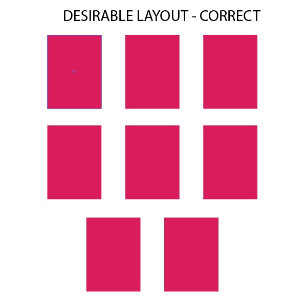
I even checked here and tried to use David DeSandro's repository but with no success. So please guys can you help me here to achieve the layout above? Thank you all in advance.
