Is there any way to create EditText that has rounded corners?
Asked
Active
Viewed 3.1e+01k times
305
Gabriele Mariotti
- 192,671
- 57
- 469
- 489
pixel
- 21,352
- 30
- 113
- 196
8 Answers
604
There is an easier way than the one written by CommonsWare. Just create a drawable resource that specifies the way the EditText will be drawn:
<?xml version="1.0" encoding="utf-8"?>
<!--  res/drawable/rounded_edittext.xml -->
<shape xmlns:android="http://schemas.android.com/apk/res/android"
    android:shape="rectangle"
    android:padding="10dp">

    <solid android:color="#FFFFFF" />
    <corners
        android:bottomRightRadius="15dp"
        android:bottomLeftRadius="15dp"
        android:topLeftRadius="15dp"
        android:topRightRadius="15dp" />
</shape>
Then, just reference this drawable in your layout:
<?xml version="1.0" encoding="utf-8"?>
<LinearLayout xmlns:android="http://schemas.android.com/apk/res/android"
    android:orientation="vertical"
    android:layout_width="fill_parent"
    android:layout_height="fill_parent">

    <EditText
        android:layout_width="fill_parent"
        android:layout_height="wrap_content"
        android:padding="5dip"
        android:background="@drawable/rounded_edittext" />
</LinearLayout>
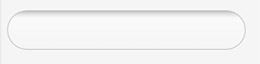
You will get something like:
Edit
Based on Mark's comment, I want to add the way you can create different states for your EditText:
<?xml version="1.0" encoding="utf-8"?>
<!-- res/drawable/rounded_edittext_states.xml -->
<selector xmlns:android="http://schemas.android.com/apk/res/android">
    <item
        android:state_pressed="true"
        android:state_enabled="true"
        android:drawable="@drawable/rounded_focused" />
    <item
        android:state_focused="true"
        android:state_enabled="true"
        android:drawable="@drawable/rounded_focused" />
    <item
        android:state_enabled="true"
        android:drawable="@drawable/rounded_edittext" />
</selector>
These are the states:
<?xml version="1.0" encoding="utf-8"?>
<!-- res/drawable/rounded_edittext_focused.xml -->
<shape xmlns:android="http://schemas.android.com/apk/res/android"
    android:shape="rectangle" android:padding="10dp">

    <solid android:color="#FFFFFF"/>
    <stroke android:width="2dp" android:color="#FF0000" />
    <corners
        android:bottomRightRadius="15dp"
        android:bottomLeftRadius="15dp"
        android:topLeftRadius="15dp"
        android:topRightRadius="15dp" />
</shape>
And... now, the EditText should look like:
<?xml version="1.0" encoding="utf-8"?>
<LinearLayout xmlns:android="http://schemas.android.com/apk/res/android"
    android:orientation="vertical"
    android:layout_width="fill_parent"
    android:layout_height="fill_parent">

    <EditText
        android:layout_width="fill_parent"
        android:layout_height="wrap_content"
        android:text="@string/hello"
        android:background="@drawable/rounded_edittext_states"
        android:padding="5dip" />
</LinearLayout>
-
15Except that your solution uses the same drawable for all states. A regular `EditText` has different backgrounds for focused, disabled, pressed, and selected, besides the default. Focused, in particular, may be important going forward if we get some Android devices that lack touchscreens, like Google TV. – CommonsWare Sep 05 '10 at 15:47
-
This is great! It works fine on the device but prevents the 'Graphical Layout' view from displaying my activity when I include the rounded edit box. The error log gives me a 'UnsupportedOperationException:null'. Any ideas? – Ben Clayton Apr 06 '11 at 15:13
-
Good to know... actually I don't know how to fix it. I guess it's an Eclipse's ADT bug. – Cristian Apr 06 '11 at 15:31
-
excellent answer. When I try to do it with latest ADT, nothing happens but the UI design screen becomes kind of shaded.. bit annyoing though. But excelent answer. SAved me from my boss :) – Jay Mayu Jul 26 '11 at 17:13
-
A slight fix, change android:drawable="@drawable/rounded_focused" to android:drawable="@drawable/rounded_edittext_focused" – Ashraf Bashir Jan 03 '13 at 09:11
-
2if your radius is same for all the 4 corners use `android:radius` instead of defining 4 lines – Viswanath Lekshmanan Dec 31 '13 at 11:19
-
How come I am seeing the green underline bar ? Is there a way to hide it without setting the background color to transparent ? – Scaraux Apr 29 '16 at 12:52
-
You must use `
` instead of defining it for all corners. Otherwise "Path.isConvex is not supported" error will be shown while rendering image. – Shaishav Jogani Jul 15 '16 at 06:41
130
Here is the same solution (with some extra bonus code) in just one XML file:
<?xml version="1.0" encoding="utf-8"?>
<!--  res/drawable/edittext_rounded_corners.xml -->
<selector xmlns:android="http://schemas.android.com/apk/res/android">

<item android:state_pressed="true" android:state_focused="true">
    <shape>
        <solid android:color="#FF8000"/>
        <stroke
            android:width="2.3dp"
            android:color="#FF8000" />
         <corners
            android:radius="15dp" />
    </shape>
</item>

<item android:state_pressed="true" android:state_focused="false">
    <shape>
        <solid android:color="#FF8000"/>
        <stroke
            android:width="2.3dp"
            android:color="#FF8000" />
        <corners
            android:radius="15dp" />
    </shape>
</item>

<item android:state_pressed="false" android:state_focused="true">
    <shape>
        <solid android:color="#FFFFFF"/>
        <stroke
            android:width="2.3dp"
            android:color="#FF8000" />
        <corners
            android:radius="15dp" />
    </shape>
</item>

<item android:state_pressed="false" android:state_focused="false">
    <shape>
        <gradient
            android:startColor="#F2F2F2"
            android:centerColor="#FFFFFF"
            android:endColor="#FFFFFF"
            android:angle="270"
        />
        <stroke
            android:width="0.7dp"
            android:color="#BDBDBD" />
        <corners
            android:radius="15dp" />
    </shape>
</item>

<item android:state_enabled="true">
    <shape>
        <padding
                android:left="4dp"
                android:top="4dp"
                android:right="4dp"
                android:bottom="4dp"
            />
    </shape>
</item>

</selector>
You then just set the background attribute to edittext_rounded_corners.xml file:
<EditText  android:id="@+id/editText_name"
      android:background="@drawable/edittext_rounded_corners"/>
-
-
I tried using the above solution but unfortunately, while I just set `topRightRadius`and `topLeftRadius` all four corners end up rounded. Please help. :( – ikartik90 Sep 29 '14 at 18:53
32
Try this one,
Create
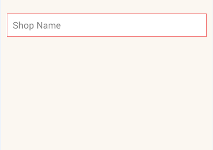
rounded_edittext.xmlfile in your Drawable<?xml version="1.0" encoding="utf-8"?> <shape xmlns:android="http://schemas.android.com/apk/res/android" android:shape="rectangle" android:padding="15dp"> <solid android:color="#FFFFFF" /> <corners android:bottomRightRadius="0dp" android:bottomLeftRadius="0dp" android:topLeftRadius="0dp" android:topRightRadius="0dp" /> <stroke android:width="1dip" android:color="#f06060" /> </shape>Apply background for your
EditTextin xml file<EditText android:id="@+id/edit_expiry_date" android:layout_width="match_parent" android:layout_height="wrap_content" android:padding="10dip" android:background="@drawable/rounded_edittext" android:hint="@string/shop_name" android:inputType="text" />You will get output like this
Amrito
- 25
- 7
sachin pangare
- 1,377
- 14
- 11
-
1Sachin your output image shows square corners not rounded one's as requested by questioner. This might be a good way to get the box to have an outline. – JesseBoyd Jun 11 '17 at 23:45
-
2@JesseBoyd, Your concern is right but rounded_edittext in this xml file just change the values of all Radius as per your requirement. – sachin pangare Jun 13 '17 at 17:13
19
Thanks for Norfeldt's answer. I slightly changed its gradient for a better inner shadow effect.
<item android:state_pressed="false" android:state_focused="false">
    <shape>
        <gradient
            android:centerY="0.2"
            android:startColor="#D3D3D3"
            android:centerColor="#65FFFFFF"
            android:endColor="#00FFFFFF"
            android:angle="270"
            />
        <stroke
            android:width="0.7dp"
            android:color="#BDBDBD" />
        <corners
            android:radius="15dp" />
    </shape>
</item>
Looks great in a light backgrounded layout..
Abdul Saleem
- 7,999
- 4
- 35
- 37
7
By my way of thinking, it already has rounded corners.
In case you want them more rounded, you will need to:
- Clone all of the nine-patch PNG images that make up an
EditTextbackground (found in your SDK) - Modify each to have more rounded corners
- Clone the XML
StateListDrawableresource that combines thoseEditTextbackgrounds into a singleDrawable, and modify it to point to your more-rounded nine-patch PNG files - Use that new
StateListDrawableas the background for yourEditTextwidget
CommonsWare
- 910,778
- 176
- 2,215
- 2,253
5
With the Material Components Library you can use the MaterialShapeDrawable to draw custom shapes.
With a EditText you can do:
    <EditText
        android:id="@+id/edittext"
        ../>
Then create a MaterialShapeDrawable:
float radius = getResources().getDimension(R.dimen.default_corner_radius);

EditText editText = findViewById(R.id.edittext);
//Apply the rounded corners
ShapeAppearanceModel shapeAppearanceModel = new ShapeAppearanceModel()
                .toBuilder()
                .setAllCorners(CornerFamily.ROUNDED,radius)
                .build();

MaterialShapeDrawable shapeDrawable =
            new MaterialShapeDrawable(shapeAppearanceModel);
//Apply a background color
shapeDrawable.setFillColor(ContextCompat.getColorStateList(this,R.color.white));
//Apply a stroke
shapeDrawable.setStroke(2.0f, ContextCompat.getColor(this,R.color.colorAccent));

ViewCompat.setBackground(editText,shapeDrawable);
It requires the version 1.1.0 of the library.
Gabriele Mariotti
- 192,671
- 57
- 469
- 489
4
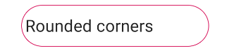
Just to add to the other answers, I found that the simplest solution to achieve the rounded corners was to set the following as a background to your Edittext.
<?xml version="1.0" encoding="utf-8"?>
<shape xmlns:android="http://schemas.android.com/apk/res/android">

    <solid android:color="@android:color/white"/>
    <corners android:radius="8dp"/>

</shape>
A Droid
- 945
- 10
- 19
3
If you want only corner should curve not whole end, then use below code.
<?xml version="1.0" encoding="utf-8"?>
<shape xmlns:android="http://schemas.android.com/apk/res/android" >

    <corners android:radius="10dp" />

    <padding
        android:bottom="3dp"
        android:left="0dp"
        android:right="0dp"
        android:top="3dp" />

    <gradient
        android:angle="90"
        android:endColor="@color/White"
        android:startColor="@color/White" />

    <stroke
        android:width="1dp"
        android:color="@color/Gray" />

</shape>
It will only curve the four angle of EditText.
Satan Pandeya
- 3,460
- 4
- 22
- 47
Kirtikumar A.
- 3,892
- 40
- 41