14

When opening the demo application from core-layout with the embedded browser in the Facebook app on iOS 9.x (at least), the footer element is not visible when the device is in portrait mode. If you rotate the device to landscape mode, the footer will be partially visible. However, the footer (with a button) should be completely visible.

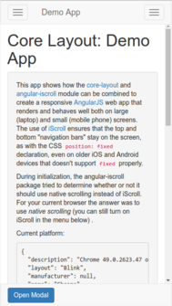
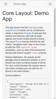
The first image shows how the demo app should look, while the second image shows how the demo app is missing the footer when viewed with the Facebook app's embedded web view (the images were grabbed from a Chrome desktop browser illustrating how the bug is manifested):

How the demo _should_ look. Demo with missing footer.

After testing a lot of different hypotheses, we concluded that the bug was caused by the browser making the page/viewport higher than the visible area.

This bug seemed related to iOS9 Safari viewport issues, meta not scaling properly? and Web page not getting 100% height in Twitter app on iOS 8.

Community
  • 1
  • 1
Martin Thorsen Ranang
  • 2,241
  • 1
  • 30
  • 43

4 Answers4

11

The solution we came up with was a combination of other answers we found on StackOverflow, while paying strong attention to details. I will stress that implementing just some of the below changes did not fix the bug; all the changes had to be made.

  • The CSS defining the height of the wrapping div element (#outer-wrap) had to be changed from

    outer-wrap {
      position: absolute;
      width: 100%;
      height: 100%;
      overflow: hidden;
    }
    

    to

    html, body, #outer-wrap {
      position: absolute;
      top: 0;
      left: 0;
      bottom: 0;
      right: 0;
      overflow: hidden;
    }
    
  • The following function was added to the library, and is called upon initialization:

    function _fixViewportHeight() {
        var html = document.querySelector('html');
    
        function _onResize(event) {
            html.style.height = window.innerHeight + 'px';
        }
    
        window.addEventListener('resize', _.debounce(_onResize, 125, {
            leading: true,
            maxWait: 250,
            trailing: true
        }));
    
        _onResize();
    }
    
    _fixViewportHeight();
    
  • The viewport meta tag had to be

    <meta name="viewport"
      content="width=device-width, initial-scale=1.0, maximum-scale=1.0, target-densityDpi=device-dpi">
    

    However, the scale values had to be 1.0, not 1; that caused the fix to break in one of our build processes where we applied html-minifier, which replaced the decimal values with integer ones. The html-minifier problem was fixed by surrounding the viewport meta tag with <!-- htmlmin:ignore --> comments.

Martin Thorsen Ranang
  • 2,241
  • 1
  • 30
  • 43
  • 2
    Just a small note: had to add minimum-scale=1.0 to the viewport meta tag as well to get this to work. Also, you are true hero for figuring this out - you just saved us getting a big release out on time! – AlexZ Dec 10 '16 at 04:45
  • 2
    While this worked it also introduced 2 new bugs: 1) When scrolling on the footer element itself, it [pushes the page up](https://cloudup.com/c0nmmvms7Oy) and gets stuck there. 2) When refreshing the page without touching it, the page [gets pushed up twice](https://cloudup.com/iurmXCOA3zE). I've been able to reproduce the solution above and the 2 bugs on my app, but no fix yet. – Danny_Joris May 05 '17 at 13:11
  • @Danny_Joris I have been running into the same "pushed up page" bug that you described above. Did you ever manage to find a fix? – AlexZ Jul 11 '17 at 23:37
  • I fixed pushing the page up by resetting body scroll position with `document.body.scrollTop = 0` – Qwal Jul 20 '17 at 13:37
1

Had the same problem, but all I had to do was use window.innerHeight, instead of document.body.clientHeight.

Craigo
  • 2,630
  • 22
  • 18
1

For those looking for alternatives to Martin's answer, you can also update your CSS when you detect Facebook in-app browser.

My problem was essentially CSS-related : bottom elements were hidden.

function adaptCSSFbBrowser() {
  var ua = navigator.userAgent || navigator.vendor || window.opera;
  if (isFacebookApp(ua)) { // Facebook in-app browser detected
      $('.bottombar').css('height', '50vh'); // Update css
  }
};

And then :

$(document).ready(function() {
  adaptCSSFbBrowser();
  ...
gowithefloww
  • 1,861
  • 2
  • 17
  • 28
  • I know it's kind of late comment, but what that isFacebook(ua) is supposed to do? how do you actually check that is a in-app browser? I'm facing a similar issue with android in-app and I can't get any difference between regular browser and in-app browser. Thanks! – soni Apr 22 '19 at 14:09
1

To understand the reason for bug with the height you need to know how FB in-app browser opens: it has animation on opening and browser size is increasing from bottom to top. And that is why on start page height calculated by JS could be incorrect

  • window.innerHeight,
  • document.documentElement.clientHeight,
  • document.body.clientHeight
  • element.style.height='100vh'

Height could be less than final page height because JS could be executed during opening animation while browser height is still increasing

I've solved this problem by reaching to screen.height which is always constant

to detect when app is opened in facebook in-app browser I use function from here How to detect Facebook in-app browser?

function isFacebookApp() {
    var ua = navigator.userAgent || navigator.vendor || window.opera;
    return (ua.indexOf('FBAN') > -1) || (ua.indexOf('FBAV') > -1);
}

P.S. same bug could be with width calculation,screen.width will help with it

Dmitriy Sakhno
  • 335
  • 2
  • 8