57

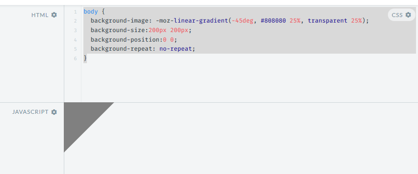
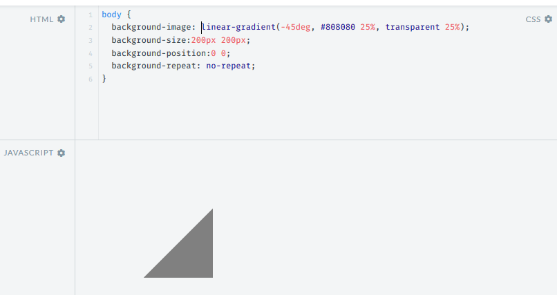
I want to create a checkerboard pattern using gradients. I've found an example and modified it to my needs, however it only works with -moz prefix. When I remove the -moz prefix, the pattern is completely different. comparison of patterns : normal vs. -moz

How can I make this -moz checkerboard pattern work with unprefixed linear-gradient?
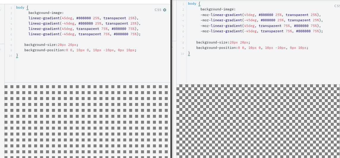
body {
  background-image:
  linear-gradient(45deg, #808080 25%, transparent 25%), 
  linear-gradient(-45deg, #808080 25%, transparent 25%),
  linear-gradient(45deg, transparent 75%, #808080 75%),
  linear-gradient(-45deg, transparent 75%, #808080 75%);

  background-size:20px 20px;    
  background-position:0 0, 10px 0, 10px -10px, 0px 10px;
}
Harry
  • 80,224
  • 23
  • 168
  • 185
Maciej Krawczyk
  • 10,012
  • 5
  • 30
  • 38
  • Use Autoprefixer (with npm, gulp, grunt, via Prepros 4, any tool really) and you won't have any problem with prefixes ever. Or else caniuse.com is the reference for this sort of things (search "gradient" and then click "View all (versions)" button) – FelipeAls Feb 12 '16 at 13:33
  • related: https://stackoverflow.com/q/55455177/8620333 – Temani Afif Jan 16 '21 at 20:12

5 Answers5

96

Just modify the background-position like in the below snippet to get the required output. This works fine in Firefox, Chrome, Opera, IE11 and Edge.

body {
  background-image: linear-gradient(45deg, #808080 25%, transparent 25%), linear-gradient(-45deg, #808080 25%, transparent 25%), linear-gradient(45deg, transparent 75%, #808080 75%), linear-gradient(-45deg, transparent 75%, #808080 75%);
  background-size: 20px 20px;
  background-position: 0 0, 0 10px, 10px -10px, -10px 0px;
}

The problem seems to be happening because of a difference in the way the angles are handled by the -moz linear gradient and the standard one. -45deg in the -moz linear gradient seems to be equal to 135deg in the standard gradient (but changing the angle is resulting in a strange dot in the middle).

The below screenshots show the difference (both taken in the latest Firefox v44.0).

Output with -moz-linear-gradient:

enter image description here

Output with linear gradient:

enter image description here

Harry
  • 80,224
  • 23
  • 168
  • 185
36

The 45deg version works nicely, but can end up showing a line between the triangles at different zoom levels or on retina screens. Depending on what browsers you need to support you can also use background-blend-mode: difference (Caniuse currently shows support nearly everywhere except IE), you can tint the checks using an additional background image:

body {
    background-image: /* tint image */
                      linear-gradient(to right, rgba(192, 192, 192, 0.75), rgba(192, 192, 192, 0.75)),
                      /* checkered effect */
                      linear-gradient(to right, black 50%, white 50%),
                      linear-gradient(to bottom, black 50%, white 50%);
    background-blend-mode: normal, difference, normal;
    background-size: 2em 2em;
}
TylerH
  • 19,065
  • 49
  • 65
  • 86
pmccloghrylaing
  • 1,020
  • 7
  • 11
17

It's 2020 and this can now be created with a single CSS gradient (if you don't need to support IE/ pre-Chromium Edge).

html {
  background: repeating-conic-gradient(#808080 0% 25%, transparent 0% 50%) 
              50% / 20px 20px
}

I wrote a detailed explanation on CSS Tricks for how this works.

TylerH
  • 19,065
  • 49
  • 65
  • 86
Ana
  • 33,368
  • 6
  • 74
  • 119
8

This was Chrome's implementation for when you opened an image with transparency for a while (though they later removed it in favor of just using a solid background).

body {
    background-position: 0px 0px, 10px 10px;
    background-size: 20px 20px;
    background-image: linear-gradient(45deg, #eee 25%, transparent 25%, transparent 75%, #eee 75%, #eee 100%),linear-gradient(45deg, #eee 25%, white 25%, white 75%, #eee 75%, #eee 100%);
}
TylerH
  • 19,065
  • 49
  • 65
  • 86
Grant Gryczan
  • 473
  • 7
  • 21
  • 1
    @mix3d When I first looked at this change, my laptop's brightness was apparently too dim to show the background effect, so it didn't appear "how it would look". Now that I'm on a desktop monitor, I see the slight checkered effect; rolled back. – TylerH Jan 22 '21 at 14:09
4

Thanks Harry for the inspiration - here's an scss mixin to do that

@mixin checkers($size: 50px, $contrast: 0.07) {
  $checkerColor: rgba(#000, $contrast);
  $angle: 45deg;
  $tp: 25%;

  background-image: linear-gradient($angle, $checkerColor $tp, transparent $tp),
    linear-gradient(-$angle, $checkerColor $tp, transparent $tp),
    linear-gradient($angle, transparent 3 * $tp, $checkerColor 3 * $tp),
    linear-gradient(-$angle, transparent 3 * $tp, $checkerColor 3 * $tp);
  background-size: $size $size;
  background-position: 0 0, 0 $size/2, $size/2 -1 * $size/2, -1 * $size/2 0;
}
Stephen
  • 7,809
  • 7
  • 38
  • 67