3

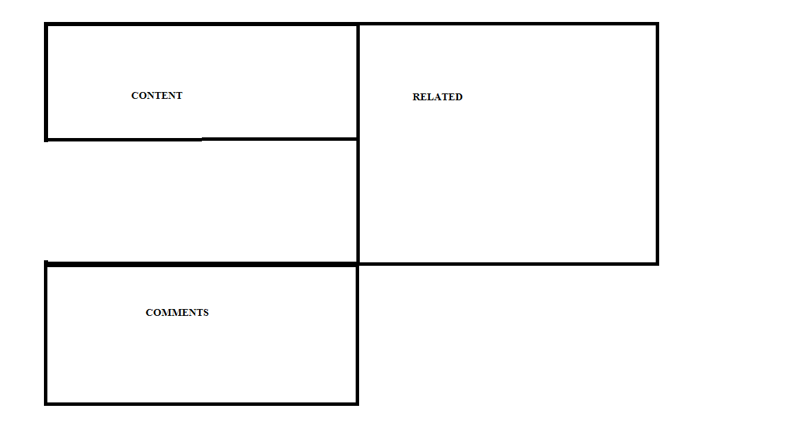
I'm learning bootstrap. I used paint to make a quick mockup of what I want to try to create with Bootstrap 4 and its new flex support. My issue is seen in the problem paint sketch; since Flexbox equalizes height, the comments section is appearing below the end of the Related section.

I've already tried putting the comments section within the content column and then attempted rearranging the CSS flex order in the code, but the order CSS rules only appear to work within each row (doesn't seem possible to insert things from other rows).

Original code:

<div class="container">
<div class="row">

    <div class="col-md-8 content">
    <br>
        <h2 class='var-heading'>heading</h2>
        <p>Lorem ipsum dolor sit amet, consectetur ad ut purus rutrum, mattis neque non, ornare ipsum. Integer ipsum risus, fermentum vel fringilla et, blandit molestie tellus. Sed eu lobortis dolor. Integer enim leo, tristique ut ornare sed, tincidunt at mauris!</p>
        <div class="card">
        social media bar
        </div>
    </div>

    <div class="col-md-4 related">
        <div class="row">

            <div class="col-md-6">
                <div class="card card-inverse" style="background-color: #333; border-color: #333;">
                  <div class="card-block">
                    <p class="card-text">tag 1 longer tag</p>
                  </div>
                </div>
            </div>


            <div class="col-md-6">
                <div class="card card-inverse" style="background-color: #333; border-color: #333;">
                  <div class="card-block">
                    <p class="card-text">tag 2</p>
                  </div>
                </div>
            </div>

            <div class="col-md-6">
                <div class="card card-inverse" style="background-color: #333; border-color: #333;">
                  <div class="card-block">
                    <p class="card-text">tag 3 longer tag</p>
                  </div>
                </div>
            </div>

            <div class="col-md-6">
                <div class="card card-inverse" style="background-color: #333; border-color: #333;">
                  <div class="card-block">
                    <h4 class="card-title">tag 4 longer tag</h4>
                  </div>
                </div>
            </div>

            <div class="col-md-6">
                <div class="card card-inverse" style="background-color: #333; border-color: #333;">
                  <div class="card-block">
                    <h4 class="card-title">tag 5</h4>
                  </div>
                </div>
            </div>
        </div>
    </div>

    <div class='col-md-2 comments'>
    commnents
    </div>

</div>
</div>

The problem: the problem

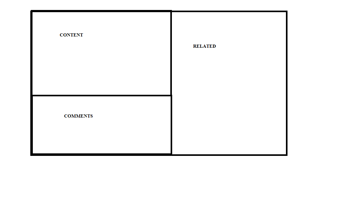
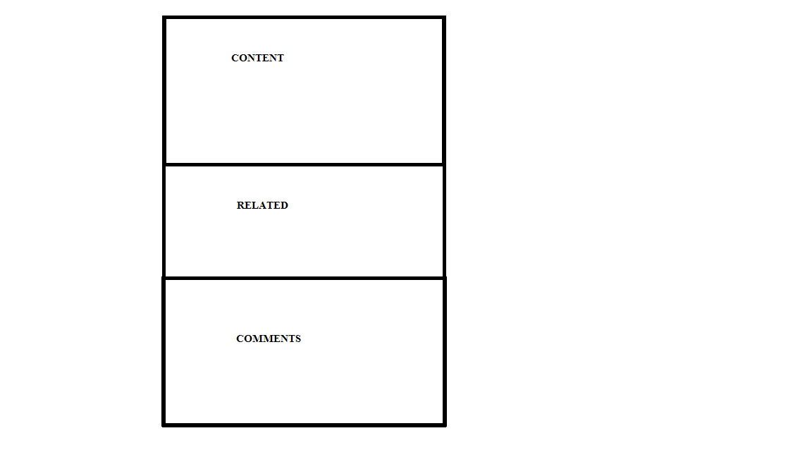
Below are the ideal mobile and desktop layout:

ideal desktop ideal mobile

cvrebert
  • 8,264
  • 2
  • 33
  • 47
Vyndion
  • 151
  • 8
  • Can't you just put *comments* and *content* into the same `col-md-8` div? – joshhunt Nov 18 '15 at 03:25
  • Yes, I tried that. Though, if you see the ideal mobile image, if I put comments in the original col-md-8 div, I can't inject related between them. Edit: I can with JS, just not sure if possible within CSS/bootstrap. – Vyndion Nov 18 '15 at 03:36
  • 1
    according to http://stackoverflow.com/a/28682463/1596547 you can not do this using flexboxes. Also see http://stackoverflow.com/a/20978785/1596547 The Bootstrap Card module can also be organized into Masonry-like columns, see: can be organized into Masonry-like columns – Bass Jobsen Nov 20 '15 at 20:45

3 Answers3

1

This might not work for you but this is the only way I can think of doing it using purely css. Essentially:

@media (min-width: 600px) {
    .content {
        float: left;
        width: 50%;
    }

    .related {
        float: right;
        width: 50%;  
    }

    .comments {
        float: left;
        width: 50%;  
    }
}

Not sure how this will fit in with Bootstrap but hopefully you can use the concept to figure out a solution. Full demo.

joshhunt
  • 4,685
  • 2
  • 31
  • 56
  • Thanks for the idea, but sadly, floats don't work with flexbox. I think the solution probably is just JS to change the columns based on media width or dump flexbox entirely. – Vyndion Nov 19 '15 at 20:22
0

This layout is easy with the latest Bootstrap 4 alpha 6.

   <div class="row d-block">
        <div class="col-md-8 float-left content">
            <div class="card card-block">
                <h3>Content</h3>
            </div>
        </div>
        <div class="col-md-4 float-right related">
            <div class="card card-block">
                <h3>Related</h3>
            </div>
        </div>
        <div class="col-md-8 float-left comments">
           <div class="card card-block">
               <h3>Comments</h3>
           </div>
        </div>
   </div>

http://www.codeply.com/go/UjirdJIabc

Zim
  • 296,800
  • 77
  • 616
  • 554
-1

What I want to do isn't feasible within flex; answering my question this way just in case someone else stumbles along with a similar problem.

I wound up using a different design that uses some 'hiddens' in media queries to get a similar effect.

Vyndion
  • 151
  • 8