11

I'm developing a website featuring a restaurant's menu. Each item is available in different sizes, each at a different price. This is displayed on medium and large devices using a table, with a column for each price:

Menu in columns

On mobile devices, the screen is too narrow to properly display up to 4 different sizes per product.

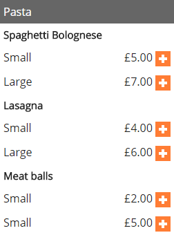
So I would like to fold columns into rows, having each row starting with the column name:

enter image description here

Is there anything like this possible using a responsive design? I'm trying to avoid maintaining two different HTML versions of the content, one visible only on mobile, and one visible only on larger screens.

I'm using Foundation 5, so I'm ideally looking for a solution using this grid system, but I'm open to any solution really.

BenMorel
  • 30,280
  • 40
  • 163
  • 285
  • Both _Small_ , and _Large_ repeat with every product. So I guess you'll have to use foundation's **visibility** classes. – Ahmed Aug 31 '15 at 14:08

2 Answers2

30

The solution involves making table cells display: block on mobile devices, and adding a data-* attribute to each cell, matching the column name.

This data attribute is injected in the cell's ::before pseudo-element with content: attr().

Example:

<table>
    <thead>
        <tr>
            <th>Pasta</th>
            <th>Small</th>
            <th>Regular</th>
        </tr>
    </thead>
    <tbody>
        <tr>
            <td>Spaghetti Bolognese</td>
            <td data-th="Small">£5.00</td>
            <td data-th="Regular">£7.00</td>
        </tr>
        <tr>
            <td>Lasagna</td>
            <td data-th="Small">£5.00</td>
            <td data-th="Regular">£7.00</td>
        </tr>
    </tbody>
</table>

CSS:

@media only screen and (max-width: 40em) {
    thead th:not(:first-child) {
        display: none;
    }

    td, th {
        display: block;
    }

    td[data-th]:before  {
        content: attr(data-th);
    }
}

You'll need to add some extra float to make it pretty.

Working example: http://codepen.io/anon/pen/medrZo

FurkanO
  • 5,510
  • 3
  • 21
  • 34
BenMorel
  • 30,280
  • 40
  • 163
  • 285
0

CSS changes for the above results

table {
    border-spacing: 0;
    }

    td,
    th {
    padding: 0.5em;
    }

    th {
    font-weight: bold;
    text-align: left;
    }

    thead th {
    background-color: #999;
    color: white;
    }

    td > div {
    float: right;
    }
@media screen and (max-width: 885px) {
thead th:not(:first-child) {
    display: none;
}

thead th:first-child:after {
    content: "'s";
}

td, th {
    display: block;
    width: 100% !important;
}
td:first-child {
    font-weight: bold;
}

td[data-th]:before {
    content: attr(data-th);
    border-radius: 10px 0px 0px 10px;
    font-weight: bold;
    min-width: 10rem;
    display: inline-block;
}

}

Bhaskara Arani
  • 1,240
  • 1
  • 18
  • 40