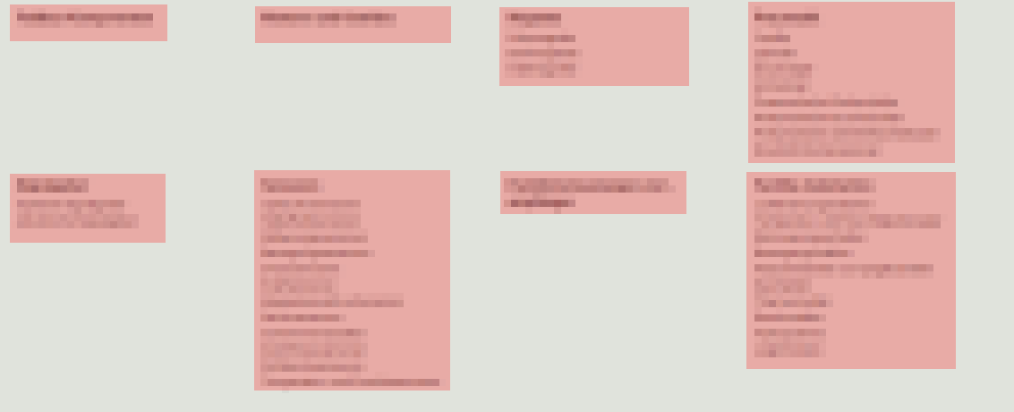
How can I make the boxes float in such a way, that the least amount of
vertical space is occupied, while maintaining the columns? (Order of
boxes does not matter)
Since you are using Bootstrap, the col-xx classes will interfere with the styles set in the bootstrap css. In order to do what you want, break free from bootstrap styling for this particular use-case and/or element(s). Rest continue using bootstrap styles.
You will need to use CSS columns here. And to keep it responsive, add all possible media queries.
You markup remains same, just remove the col-x classes. This will cause bootstrap styles to not apply.
<div class="container-fluid">
    <div id="col" class="row">
        <div>Lorem Ipsum</div>
        ...
    </div>
</div>
You now define your custom styles for child divs:
div#col > div { margin: 8px; padding: 6px; }
div#col > div:first-child { margin-top: 0px; } /* remove margin on first */
And all media queries for the parent container to allow custom column count, for example:
@media screen and (min-width:761px) {
    div#col { column-count: 4; column-gap: 0; padding: 8px; }
}
@media screen and (min-width:760px) {
    div#col { column-count: 3; column-gap: 0; padding: 8px; }
}
...
Complete Snippet:
div#col > div {
    margin: 8px; padding: 6px; background-color: #efefef;
    -webkit-column-break-inside: avoid;
}
div#col > div:first-child { margin-top: 0px; }

@media screen and (min-width:761px) {
    div#col {
        -webkit-column-count: 4; -webkit-column-gap: 0; padding: 8px;
        -moz-column-count: 4; -moz-column-gap: 0;
        column-count: 4; column-gap: 0;
    }
}
@media screen and (max-width:760px) {
    div#col {
        -webkit-column-count: 3; -webkit-column-gap: 0; padding: 8px;
        -moz-column-count: 3; -moz-column-gap: 0;
        column-count: 3; column-gap: 0;
    }
}
@media screen and (max-width:480px) {
    div#col {
        -webkit-column-count: 2; -webkit-column-gap: 0; padding: 8px;
        -moz-column-count: 2; -moz-column-gap: 0;
        column-count: 2; column-gap: 0;
    }
}
@media screen and (max-width:360px) {
    div#col {
        -webkit-column-count: 1; -webkit-column-gap: 0; padding: 8px;
        -moz-column-count: 1; -moz-column-gap: 0;
        column-count: 1; column-gap: 0;
    }
}
<link href="https://maxcdn.bootstrapcdn.com/bootstrap/3.3.5/css/bootstrap.min.css" rel="stylesheet"/>
<div class="container-fluid">
    <div id="col" class="row">
        <div>Lorem Ipsum</div>
        <div>Lorem ipsum dolor sit amet, consectetur adipiscing elit</div>
        <div>Lorem ipsum dolor sit amet, consectetur adipiscing elit</div>
        <div>Lorem ipsum dolor sit amet, consectetur adipiscing elit, sed do eiusmod tempor incididunt ut labore et dolore magna aliqua.</div>
        <div>Lorem ipsum dolor sit amet, consectetur adipiscing elit</div>
        <div>Lorem ipsum dolor sit amet, consectetur adipiscing elit, sed do eiusmod tempor incididunt ut labore et dolore magna aliqua.</div>
        <div>Lorem Ipsum</div>
        <div>Lorem ipsum dolor sit amet, consectetur adipiscing elit</div>
    </div>
</div>
Fiddle: http://jsfiddle.net/abhitalks/ar29jfqt/2/
Try resizing the pane in the above fiddle to all possible sizes and see if the columns rearrange themselves.