-3

I'm using both the screen width and screen height to detect the difference between mobile and desktops and then detect high resolution desktops vs. low resolution desktops.

I have some JavaScript that I use to load different CSS files. It looks like this:

JavaScript

<script>
  if (screen.width > 800) { 

    if (screen.height < 900) { 
      document.write('<link href="/LowRes.css" type="text/css" />'); 
    } else { 
      document.write('<link href="/HiRes.css" type="text/css" />'); 
    }

} else {

    document.write('<meta name="viewport" content="width=device-width,initial-scale=1">');
    document.write('<link href="/Mobile.css" type="text/css" />'); 
}
</script>

I want to change that and use media queries, and this is what I have:

CSS

<link media="screen and (min-device-width: 801px) and (min-device-width: 801px)" href="low.css" rel="stylesheet" />
<link media="screen and (min-device-height: 901px)" href="hi.css" rel="stylesheet" />
<link media="screen and (max-device-width: 800px) and (orientation : portrait), screen and (max-device-height: 800px) and (orientation : landscape)" href="mobile.css" rel="stylesheet" />

This allows for the mobile stylesheet to be downloaded regardless of the orientation. However, the desktop stylesheet is always set to hi-res even if it's actually low-res.

enter image description here

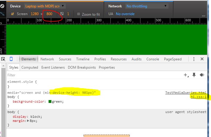
As you can see, I've got the desktop mode on height 800px, the media query is set for min-device-height:901px and yet it's downloading the hi-res stylesheet. Why is that?

halfer
  • 18,701
  • 13
  • 79
  • 158
frenchie
  • 46,331
  • 96
  • 283
  • 483
  • Why the downvote? Care to explain? – frenchie Aug 19 '15 at 15:55
  • 3
    You understand that you need media queries here, but you didn't think to maybe look into how one would go about *writing* media queries? – cimmanon Aug 19 '15 at 16:15
  • @cimmanon: this is not a duplicate! I've updated my question and the answers in the question you've pointed to have nothing to do with the question. I'm looking for 3 rules to replicate the javascript; I've updated the question. As the picture shows, I'm stuck on why the min-device-height:901px that should restrict the stylesheet to desktop low res is not working. The question is "how to write 3 rules to detect mobile/desktop low res/desktop hi res" and so far all the answers have lots of rules but not one answer has the problem reduced down to just 3 rules. So no, this is not a duplicate IMHO – frenchie Aug 20 '15 at 05:52
  • Unless you physically changed the resolution of your device, all you're doing is changing the size of the viewport, and the *device-width properties do not respond to viewport changes. If you wanted what you were asking for, you would have taken the advice in the question this was marked as a duplicate of rather than stomping your feet and declaring "this isn't a duplicate, it didn't give me the exact code I needed to copy/paste into my project!" – cimmanon Aug 20 '15 at 12:05
  • @cimmanon: well anyway, detecting mobile/low-res desktop/hi-res desktop in 3 media queries is what this question's about. For now I have it working in javascript and I'm looking to replace it. Can you revert the duplicate to see what others can come up with? – frenchie Aug 20 '15 at 12:14

1 Answers1

2

Include all CSS files to your <head>. Alternatively, you can combine them to a single CSS file.

<meta name="viewport" content="width=device-width,initial-scale=1">
<link href="/Mobile.css" type="text/css" />
<link href="/LowRes.css" type="text/css" />
<link href="/HiRes.css" type="text/css" />

Then you change the files by wrapping their contents to media queries.

@media (max-width: 800px) { 
    // all contents of Mobile.css
}
@media (min-width: 801px) and (max-height:900px) { 
    // all contents of LowRes.css
}
@media (min-width: 801px) and (min-height:901px) { 
    // all contents of HiRes.css
}

Take a look here for CSS media queries. As an alternative you could use nested media queries but some old browsers might not support them.

Community
  • 1
  • 1
Tasos K.
  • 7,669
  • 7
  • 38
  • 57
  • That doesn't work because if a user is on a mobile and rotates to landscape then he's not on mobile anymore. – frenchie Aug 19 '15 at 23:12
  • I see. Using only media queries you cannot detect the device type. You will still need to rely on JavaScript to make this distinction (see [this](http://stackoverflow.com/questions/22085063)). Also [this](http://stackoverflow.com/questions/4817029) might be helpful. – Tasos K. Aug 20 '15 at 07:13
  • Ok, could you vote to reopen the question?? – frenchie Aug 20 '15 at 11:00
  • Sure thing. R u still looking for a CSS-only solution? – Tasos K. Aug 20 '15 at 11:53
  • Yes, my goal is to replace the javascript with a pure CSS media query implementation. – frenchie Aug 20 '15 at 11:59