Update september 2020
FireFox and edge have implemented the behaviour from the specs and margin + padding for flex elements are both calculated occording to the width of the containing block.
Just like block elements.
Update Febuary 2018
Firefox and edge have agreed to change their behaviour on top, bottom margin and padding for flex (and grid) items :
[...] e.g. left/right/top/bottom percentages all resolve against their containing block’s width in horizontal writing modes. [source]
This is not yet implemented (tested on FF 58.0.2).
Update april 2016
(still valid in may 2017)
The specs have been updated to:
Percentage margins and paddings on flex items can be resolved against either:
- their own axis (left/right percentages resolve against width, top/bottom resolve against height), or,
- the inline axis (left/right/top/bottom percentages all resolve against width)
source: CSS Flexible Box Layout Module Level 1
This means that chrome IE FF and Edge (even if they don't have the same behaviour) follow the specs recomendation.
Specs also say:
Authors should avoid using percentages in paddings or margins on flex
items entirely, as they will get different behavior in different
browsers. [source]
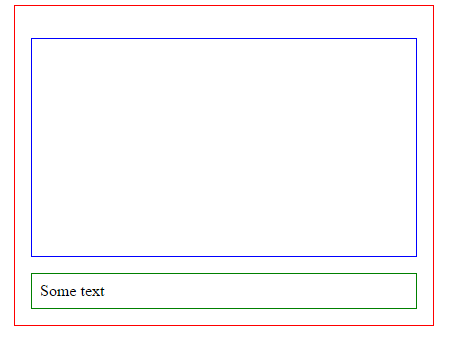
Work around :
You can wrap the first child of the flex container in an other element and put the padding-bottom on the second child :
#flexBox {
  border: 1px solid red;
  width: 50%;
  margin: 0 auto;
  padding: 1em;
  display: flex;
  flex-direction: column;
}
#text {
  border: 1px solid green;
  padding: .5em;
}
#padding {
  margin: 1em 0;
  border: 1px solid blue;
}
#padding > div {
  padding-bottom: 56.25%; /* intrinsic aspect ratio */
}
<div id='flexBox'>
  <div id='padding'><div></div></div>
  <div id='text'>Some text</div>
</div>
I tested this in modern browsers (IE, chrome, FF and Edge) and they all have the same behaviour. As the configuration of the 2nd child is the "same as usual", I suppose that older browsers (that aslo support flexbox layout module) will render the same layout.
Previous answer:
According to the specs, Firefox has the right behaviour
Explanantion :
Unlike block items which calculate their % margin/padding according to the containers width, on flex items:
Percentage margins and paddings on flex items are always resolved
against their respective dimensions; unlike blocks, they do not always
resolve against the inline dimension of their containing block.
source dev.w3.org
This means that padding-bottom/top and margin-bottom/top are calculated according to the height of the container and not the width like in non-flexbox layouts.
As you have not specified any height on the parent flex item, the bottom padding of the child is supposed to be 0px.
Here is a fiddle with a fixed height on the parent that shows that padding bottom is calculated according to the height of the display:flex; container.